Good morning,
This article from NALS gives us some basic direction to take when creating a layout. You want to grab your readers attention. Check it out below.
“Basics of Design – Layout
By Jay Moore, NALS Communications Manager
Here are some basics of layout to help you design better promotional materials. I am not going to waste any time today so let’s jump in!
Using Borders
Borders can be a great addition to a design and you should use them to frame and draw attention to a specific piece of information. You can allow the edges of text columns and artwork to create and illusion of borders as well. This is a softer, less direct way of achieving the same effect.
Directional Flow
This is probably the most important thing to think about when designing a piece. You need to create a directional flow for the eye as a way of guiding the viewer through the piece. This can be created by the way text moves through the piece and the way images are placed. Use the conventional “Z” pattern of reading (western cultures) for the strategic placement of important information. Start in the upper left corner, work across to the right and then back to the left again, going top to bottom. This is the way our eyes are trained to read so don’t fight it, use it! Also remember not to place pictures with people looking off the edge of a page. Make sure their eyes and body are facing the direction of most of the piece. We will naturally follow the eyes of the subject and if they are looking off the edge then readers will not pay attention to you text.
Focus
Draw the reader’s attention to important elements by contrasting size (scale), color, and page position. Make sure the elements have a function that supports the content. Use large, bold display type and/or graphics for the creation of focus. Use elements with visual weight, intensity, or color for focus. Do not get carried away here. It is good to use these elements in moderation. Create a piece with one or two focal points or you risk the piece being too busy and the reader will not know which element demands more focus.
Fonts
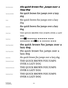
We all love fun and crazy fonts but they may not be the best way to get your message across. Rules of thumb for using fonts: 1) DO NOT USE MORE THAN 2 FONTS! It is tempting to use a new font for each headline but this will make your piece look scattered and will not tie it together. When I say don’t use more than two fonts this does not mean that you can’t mix styles of these fonts such as bold and italics. It is also a good rule to not use multiple fonts in the same family such as using two serif fonts together. They will not compliment one another. You can however mix families such as using a serif and a san serif font together or using a serif and a script together.
2) THE OBJECT IS FOR PEOPLE TO READ IT! While some fonts look cool and are very pretty they may not be able to be read from a distance. Be sure to use fonts that are easy to read and are pleasing to the eye.
3) FONT SIZE DOES MATTER! You do need to have a larger font size for the headlines and you even need a larger size for subheadlines but do not get carried away with the number of font sizes used. As a rule you do not want your body copy to be smaller than 10 points and I would recommend on flyers you not go smaller than 12. From there it really depends on the font you select but I would make subheadings from 18-24 and headlines 36-48 again depending on the font you select.
General
Some tips to remember…Don’t let bad design hurt great content. Don’t be afraid of keeping it simple. Designs do not have to be complex and over powering to reach people, often it is the simple and clean design that stands out more. Be prepared to make revisions. Most designs are not perfect after the first try so be prepared to scale it down or up depending on the feedback you get. Get feedback! We all know what we are trying to accomplish when designing something but that doesn’t necessarily translate to other readers so show people and take their critique, it will help in the long run. Be consistent. Use consistent colors and fonts to pull the piece together. Only include layout elements and copy that support the message.
Remember, the design is intended to help clarify and support the content. Use graphic devices such as white space, rules, images, and layout to help the reader understand the content. White space is a good thing. Do not think that you have to fill every inch of the page to get your message across. You can use white space as a means of directing the eye as well as a way to highlight information by leaving white space around the element.
Follow these general rules and you will improve your designs and also the impact they have on their readers!”


